Financial Services2026
Fintech Mobile App UX
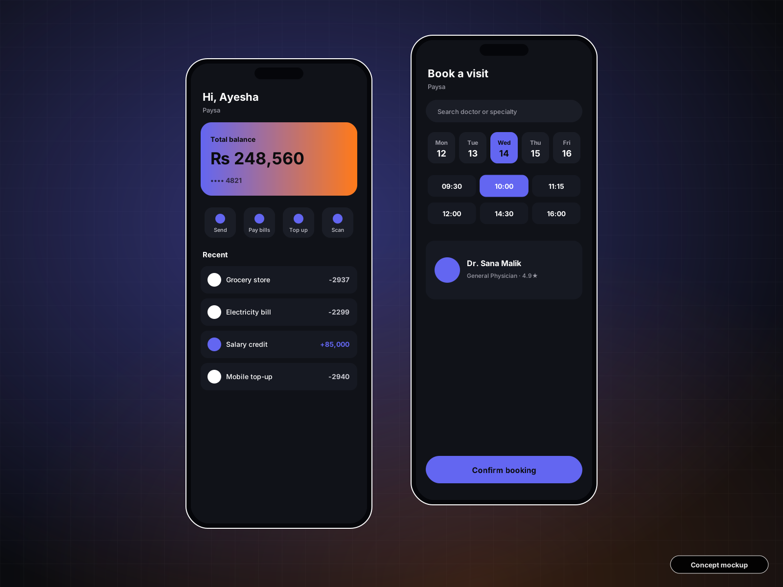
Research-led UX and a complete design system for a mobile wallet: onboarding, payments, bill-pay and spending insights.
UI/UX Design
SampleThis is a concept case study that shows how Theta X Tech approaches this kind of project. Client details are generic and the figures below are illustrative targets, not reported client results.
4 → 2
Navigation depth
12
Reusable chart patterns
Light + Dark
Themes
The problem
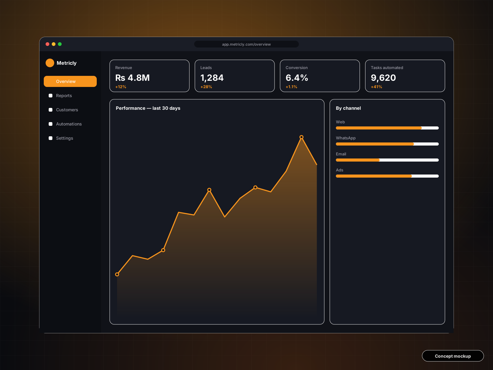
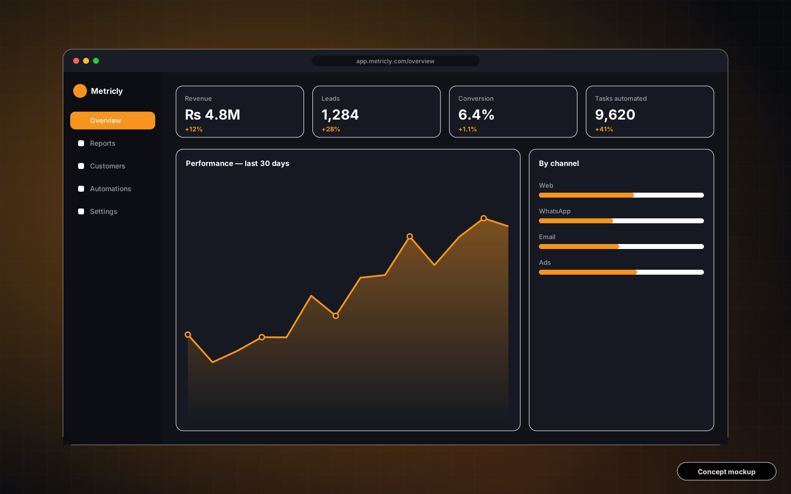
Customers struggled to find key metrics; support tickets about 'where is…' were rising.
The solution
Information architecture rebuilt around tasks, a modular widget grid, consistent charts, and saved views.
Heuristic audit, analytics review, card sorting with real users, then iterative prototypes.
This is a concept case study created to show our approach. Metrics are illustrative targets, not reported client results.
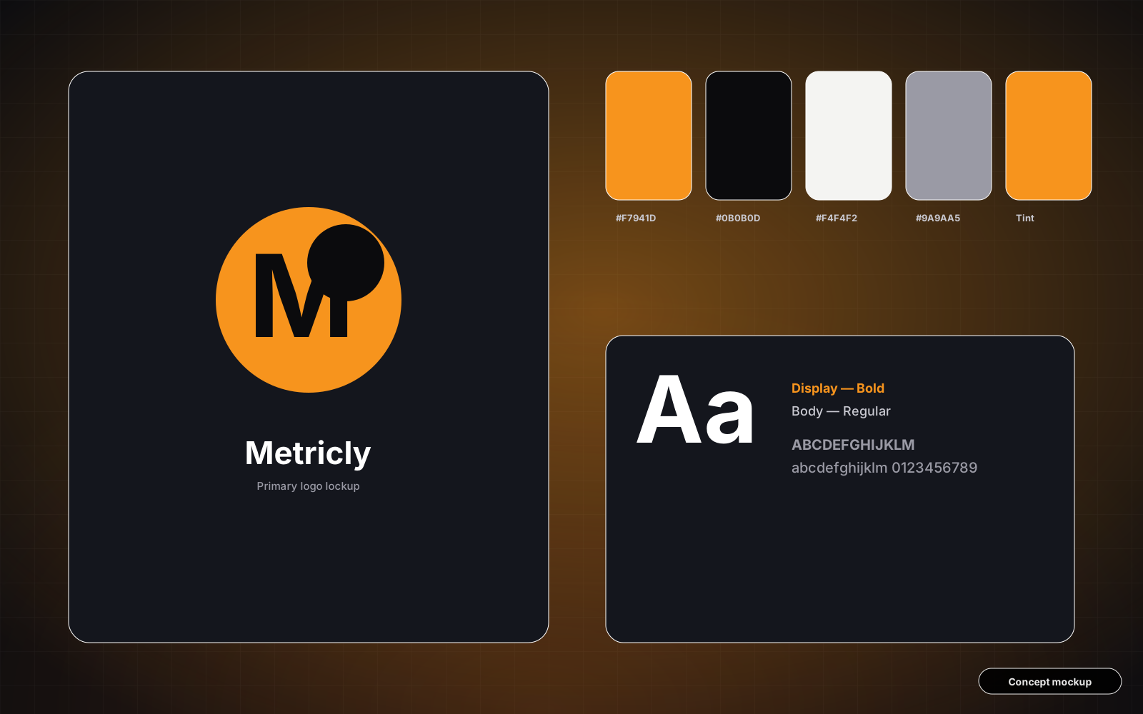
Research-led UX and a complete design system for a mobile wallet: onboarding, payments, bill-pay and spending insights.
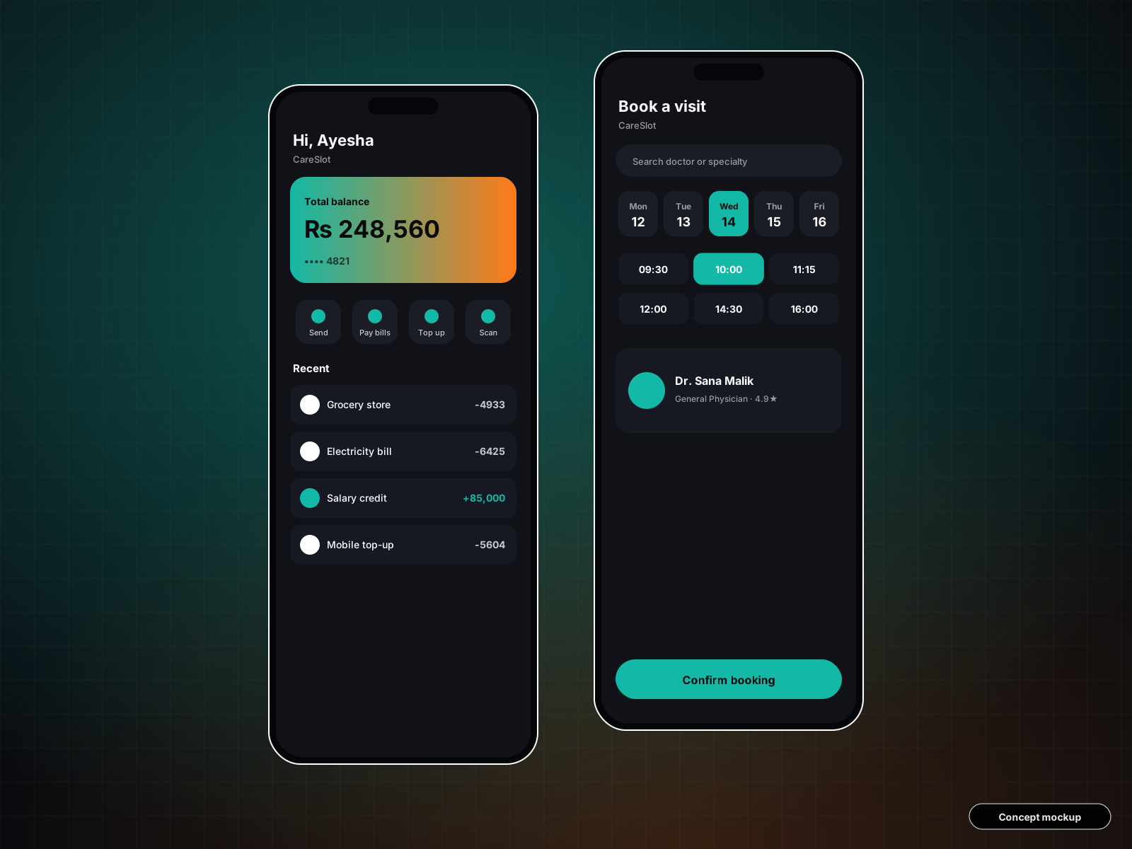
An accessible booking experience for web and mobile: find a doctor, pick a slot, get reminders and manage visits.
Tell us about your goals. We'll reply within one business day with ideas, a plan and a transparent quote.